Our New LogoYou may have noticed that with our new website, ADTA has a new logo!
This new look for ADTA came about after much consideration and many hours of idea sharing, brainstorming, discussion, and critique with a professional graphic designer.
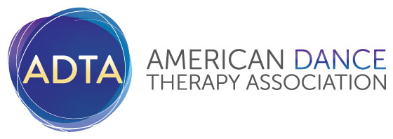
The process of developing a logo to represent not just the profession—but the association that is its vanguard—is also something we want to share with you. We hope our vision and intentions shine through, as you note the subtle details of the design. Color Scheme: We decided to use a color palette that was similar to that of our existing logo for consistency in branding; we agreed that blues created a feeling of comfort and familiarity that we appreciated and that the purples were also soothing and added an element of imagination and newness. We added a small touch of yellow, as a complementary color to our cool palette to give a bit of warmth and pop. Representation: Because representing true diversity of gender, body type, and ethnicity is problematic when trying to draw a human form, we chose to focus on the greater themes that emerge in our work as individual dance/movement therapists and as a professional association. Thusly, the concept of circles came quite naturally to us as we wanted to express inclusivity, a holding environment, containment, integration, and a continuum of existence that was clearly reflected within a circle (some may say that there are even remnants of the ADTA’s original “Egg Lady” seen within the current design). The spirals floating around the circular design along with the gradation of color in the word dance offer a glimpse of movement within the design to reflect the power of the movement we use as we connect and dance with our clients. Application: Finally, and pragmatically, we wanted a design that could be presented in a horizontal (banner) logo format, in a square format to put on product placement, and as a small, identifiable icon that could stand alone in smaller spaces proudly displaying “ADTA.” Whether heading our new website, emblazoned on the side of a tote bag, or peeking out as our social media icon, we look forward to embracing our new logo together with you all, our ADTA community.
ADTA's Historical Logos
|
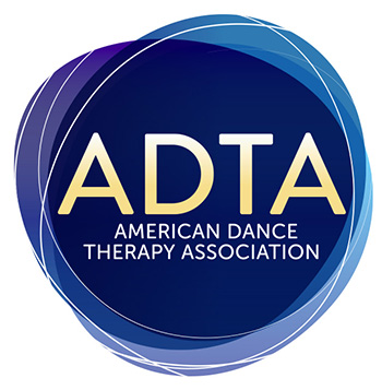 Secondary Use Logo